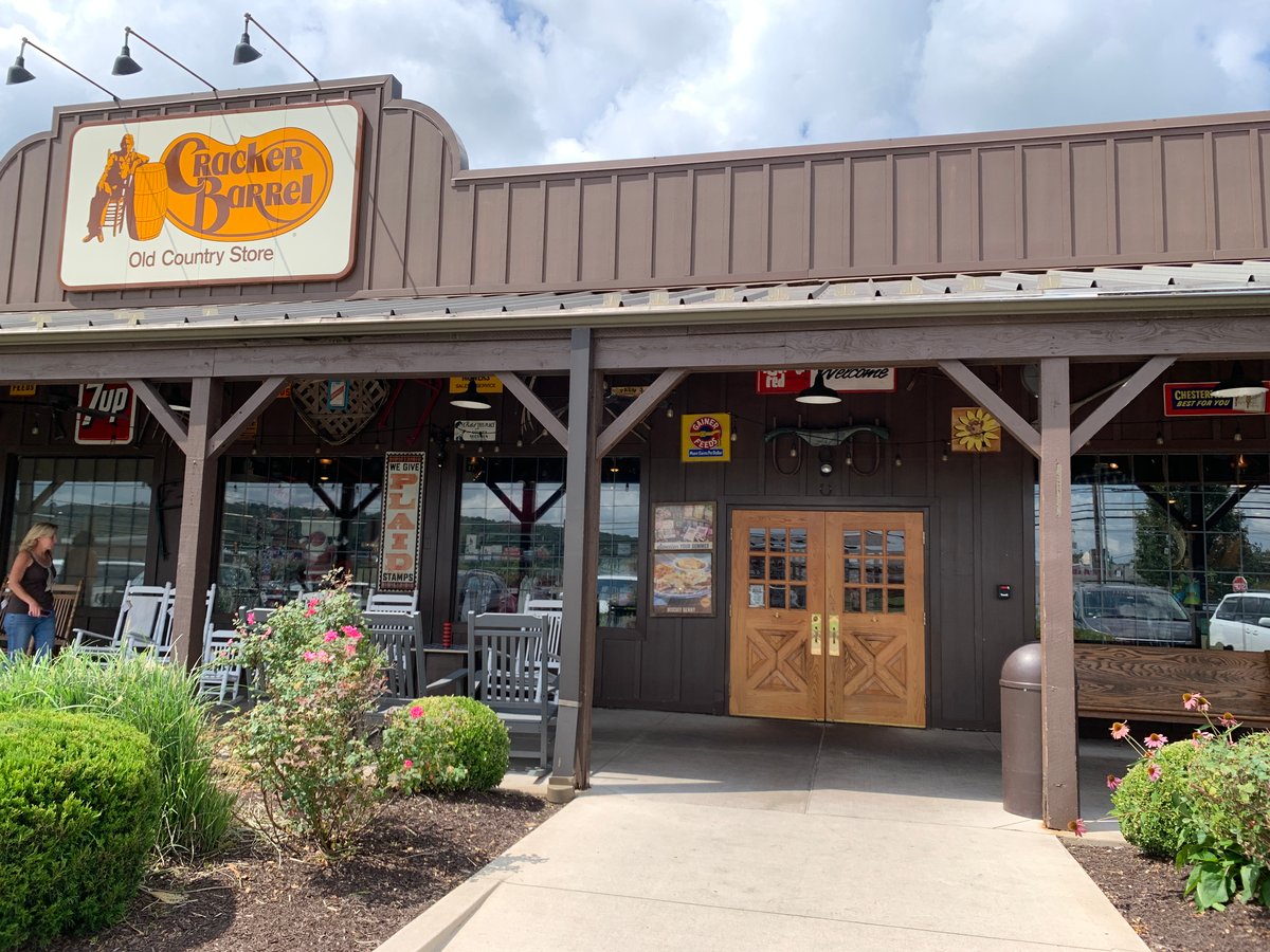
Julie Masino is stepping down as CEO of Cracker Barrel after a year of customer revolt over a logo redesign so aggressively modern it made the chain’s core demographic feel personally attacked. The old logo—a rustic, slightly unhinged depiction of a barrel and some country aesthetic—has been replaced with something that looks like it was designed by a San Francisco startup that sells artisanal kombucha to people who call themselves “digital nomads.”
The real tragedy here is not that a company lost its way. It is that a logo caused more executive turnover than actual food poisoning ever could. Masino did not resign because the biscuits got worse or the gravy recipe changed. She resigned because the internet collectively decided that Cracker Barrel had committed the cardinal sin of 2020s corporate strategy: trying too hard to be relatable to people who will never eat there anyway.
This is the absurdist core of modern branding: companies spend millions to distance themselves from the customers who actually show up, in hopes of impressing customers who will never come. Cracker Barrel wanted to look contemporary. Instead, it looked like it was ashamed of itself—which, in the eyes of a 58-year-old from rural Tennessee, is worse than looking dated.
The lesson, apparently, is that some brands are not meant to evolve. They are meant to age like a cast-iron skillet: gradually, darkly, and without apology. Masino learned this the hard way. The next CEO will probably learn it again, because this is the corporate equivalent of Groundhog Day, except the groundhog is a barrel and nobody is laughing.